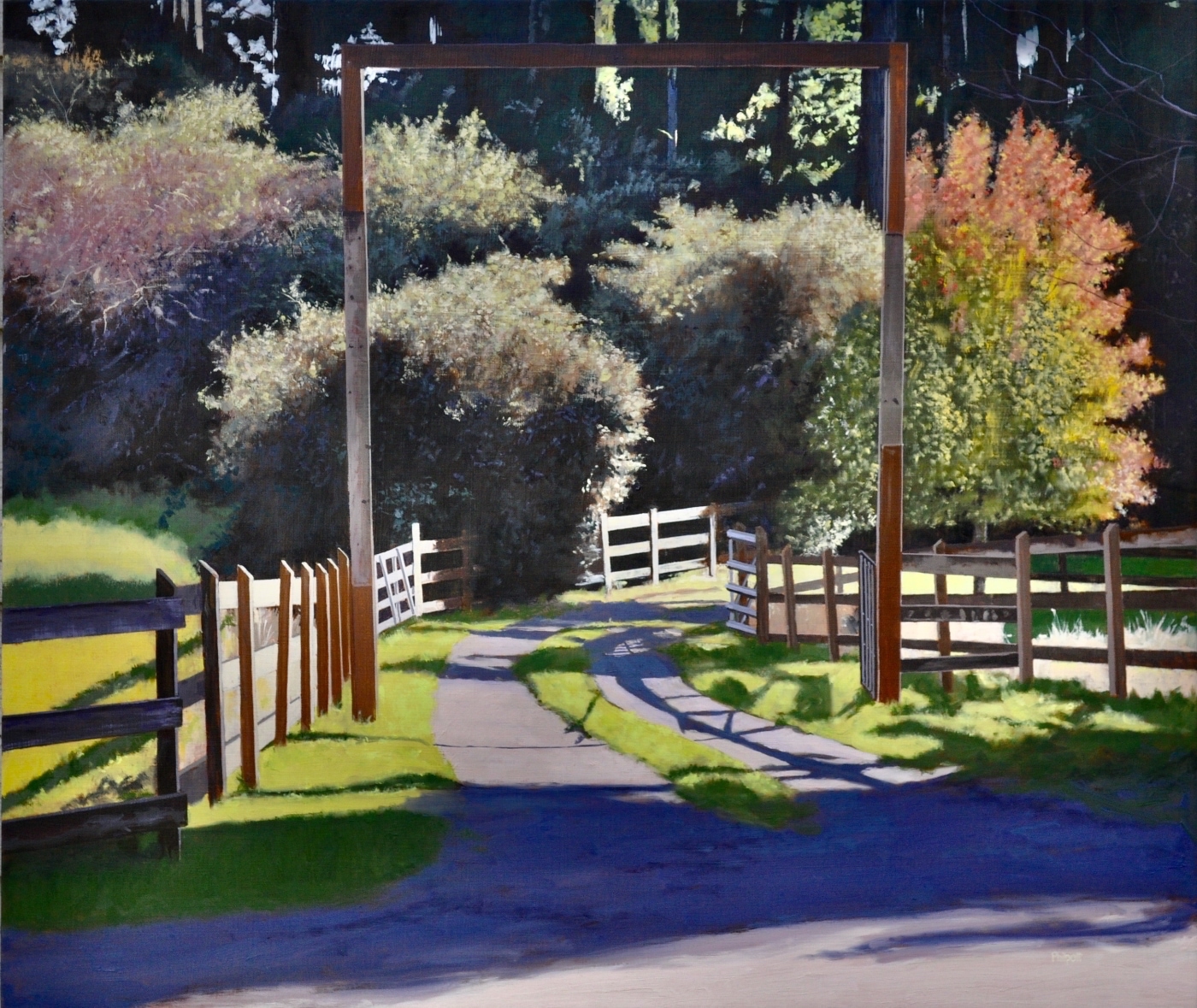
I could do a whole series on driveways. They seem to be as individual as fingerprints. Some are welcoming, while others seem to say, keep out! “Neighbor’s Drive” was inviting and seemed to have the landowner’s personality all over it. I wanted to drive down it just to see what was around the corner post.
The fence rails along the drive had interesting cast shadows that defined the lay of the land. I love the contrast between the intensity of the light and in the cast shadow it created. I also liked how the edges were lit with both pink and orange lines, and how their very exactness contrasted nicely against the amorphous rounds of the trees.
The challenge was how to keep the light bright and the fully charged with color. The foreground shadows contained lots of deep satisfying color that contrasted well against the reds, greens and yellows of the trees further down the drive.

