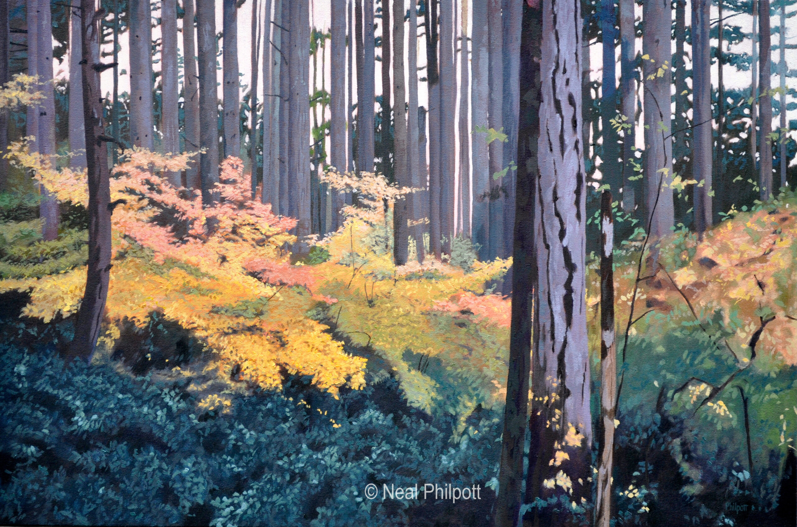
Vine maples are just the best at showing off their fall colors. I like contrasting and complementary colors in my paintings, and the warm colors of autumn contrasted against cool low light shadow areas inspired me to paint this.
The contrast of the straight trees against the floating colors of the leaves gave it a nice graphic design. These are grounded in the cool dark colors of the immediate foreground. All these things come together to create a nice fall feel for the piece.

