
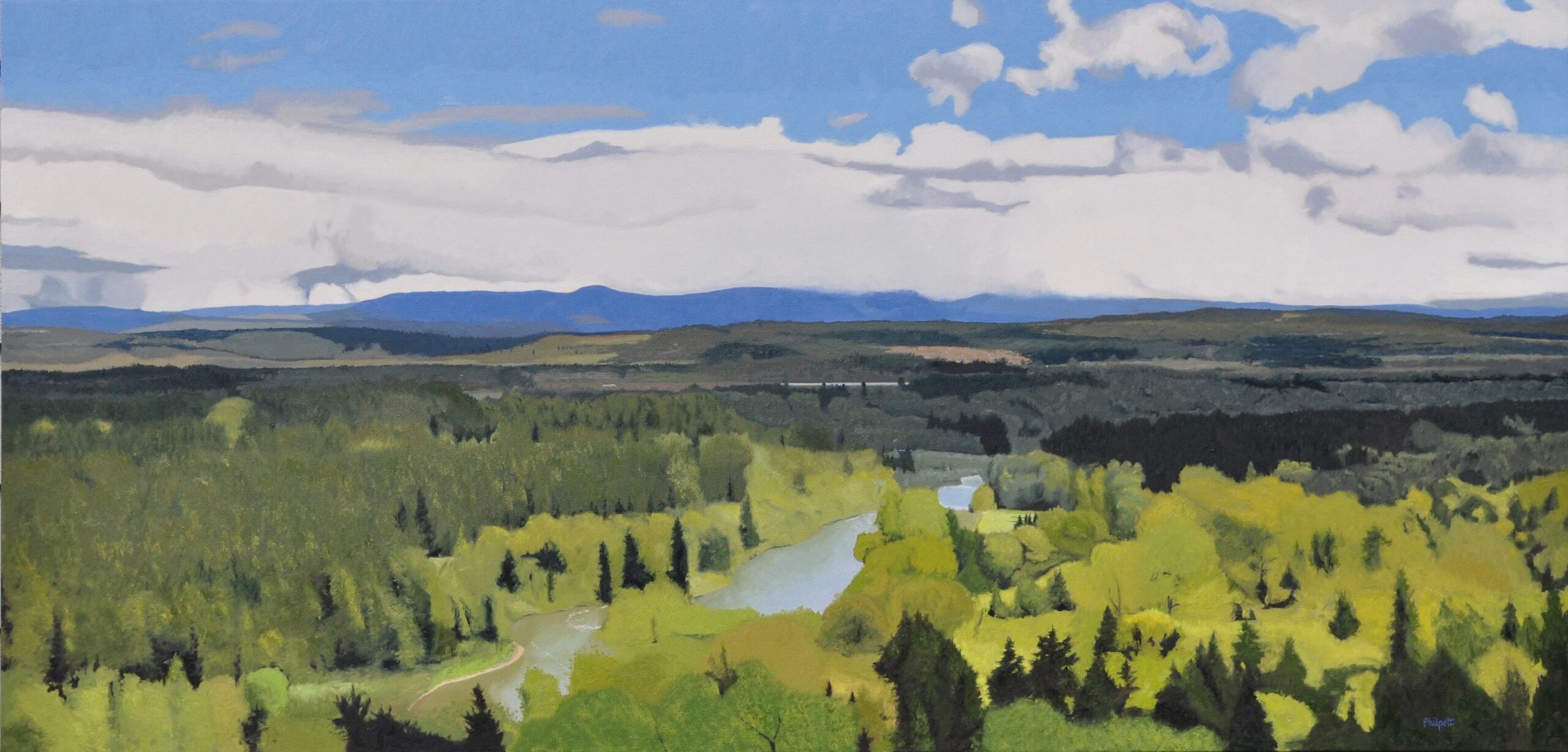
There are great views to be had all over the Pacific Northwest. I’m fortunate to have this view portrayed in Basin Spring near my studio.
I referenced a lot of images before I selected this one to paint. Why? Partly because of the clouds, but primarily I was after a certain shade of blue for the sky that had a little red in it as opposed to cyan. I used manganese violet for the red, but also used cadmium red deep to get just a slight tinge of purpleness to the sky.
Spring colors, especially the light greens, are very intense. There are few occasions to use paint this bright and I found one. The light areas around the foreground trees have mixtures that are almost pure color out of the tube. Very rare for me! Gamblin’s oil color cadmium chartreuse, knocked down with a touch of raw umber and some nickel titanite yellow, fit the bill for this area.
Like many landscape artists, I start with what’s in back working to what’s in front. This is usually from top to bottom and from sky to foreground. The sky was one challenge, but the bigger one was how to portray all that information without rendering every tiny detail and ultimately killing my desire to paint it.
I relied on my process of premixing all the colors of a certain area, applying them with my palette knife and then manipulating them with both the knife and other brushes. This approach helps to keep it loose and abstract.