
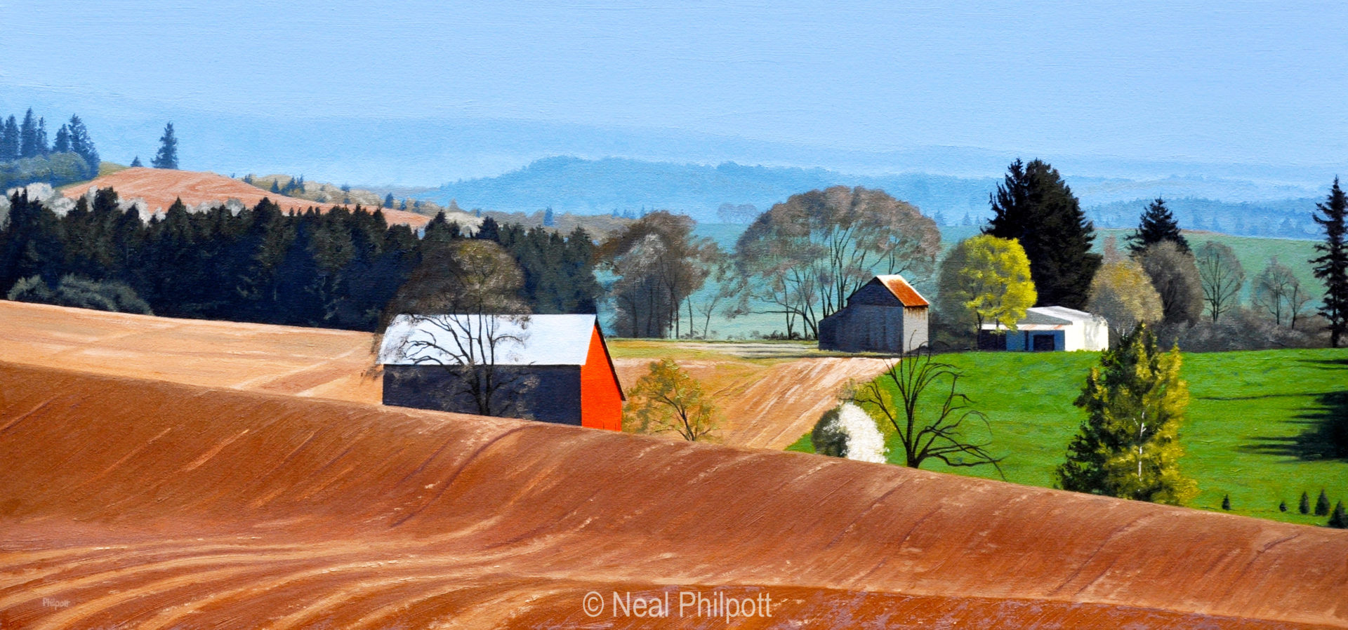
Waves is an oil landscape painting from the springtime of year. Colors are still vivid and not washed out as much as late summer. That makes for a good painting and color mixing challenge to get color, chroma and value just right to have it read believably. There’s red earth in the foreground and middle-ground and red barn paint and red rust roofing. All could be painted with the same red but I like to mix each color so there is a subtle difference between them all. Cadmium red, manganese violet, burnt Sienna, cobalt blue plus white went into those oil paint mixtures. When the colors are right they seem to fit right in.
Another aspect to be considered was keeping the perspective accurate. Waves was a challenge due to the graphic design nature created by the furrows left from the plowing and tilling of the tractors. I used various methods to maintain the drawing in the paint and also kept in mind which plane the earth was in know when to change value or chroma in order to achieve the desired effect to support the perspective.
I was inspired to paint this landscape view because it embodied the hopeful feelings of spring and a fresh new start. Oil paint is good in providing a manipulatable medium to really tune-in on nuance in each color mixture. I feel that having that control underscores my original inspiration because the clear light and resulting high key color can be best obtained in oil paint and best convey my intent.